Design Principles
The design of digital signage slides should be clean, simple, attractive, appropriate and brief, with a maximum of 10-18 words on each slide. Using multiple image slides as a series in order to communicate a single subject can extend this limited word count. The viewer should be able to comprehend single-image slides within 5 seconds and a series of image slides within 8-10 seconds. Key principles to keep in mind are brevity of your content, thoughtful design placement, and a clear call to action.
Simplicity
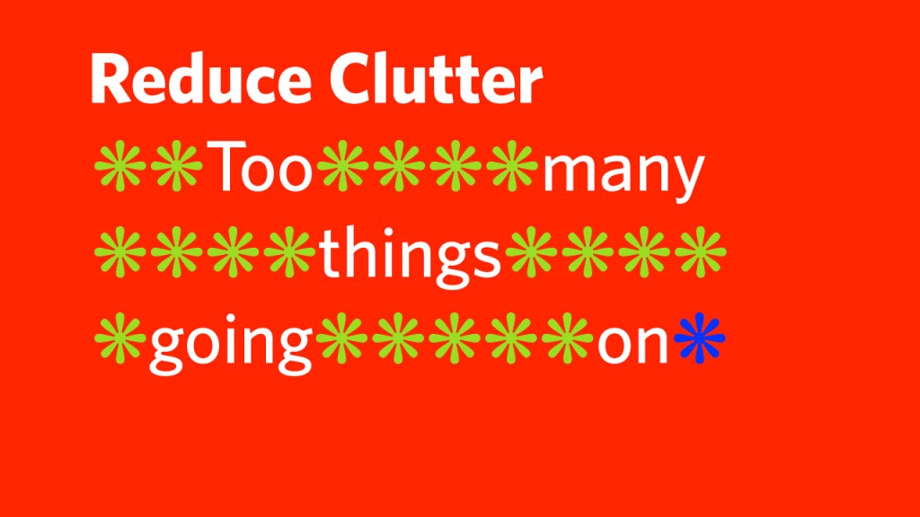
One of the most important design principles is “keeping it sweet and simple.” Also known as the KISS acronym. Is that drop shadow necessary? Are there too many photos cluttering up the message? Is an exclamation point adding to the message or detracting from it? Good design involves the process of subtraction. The best communicators know when to stop adding more and when to take away.
Legibility & Readability
The design for content on digital signage has very different legibility and readability principles than design for print because the nature of digital signage is dynamic and fast-paced. Communication can be enhanced by ensuring that each element (typography, colour and image) has the intrinsic attributes that make it clear and legible.
Copywriting
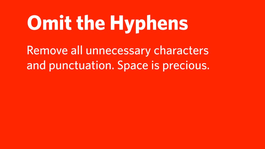
Headlines are the first chance to capture attention and engage the viewer to read the rest of the information on the slides. On average, 8 of 10 people will read a headline and 2 out of 10 will go on to read the rest of the copy. Headlines should be clearly distinct from the rest of the message or body copy. Best practices for signage applications include clear messaging, limiting the number of characters per slide, avoiding any hyphenated word breaks and using short URLS.
Layout Principles
Safe Areas
The design elements need to remain within certain safe zones to be viewable on screen. There are two types of safe zones that apply to digital signage: Title Safe and Action Safe.
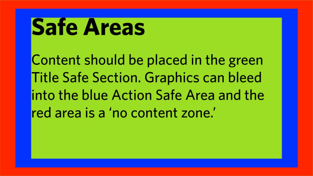
Title Safe Area (Green)
The Title Safe Area is a rectangular area that buffers content from the four edges so that text or graphics are visible on the viewable regions of the display without distortion.
Title Safe Area = 72px vertical by 128px horizontal
Action Safe Area (Blue)
The Action Safe Area extends outside the title safe area. On most displays content can be seen in the Action Safe area but it’s not recommended to place vital information within the Action Safe Area. Images and motion graphics can bleed off the Action Safe Area.
Action Safe Area = 36px vertical by 64px horizontal
Respecting UBC’s Visual Identity Elements
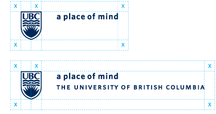
To ensure maximum impact of the UBC Signatures, allow a minimum safety area or clear space around the UBC Brand Signatures. White space surrounding the signature will visually protect it from infringement by other text and graphic elements in the layout. As shown in the diagram, clear space should be equivalent to or greater than 50% of the UBC logo width (shown as x).
Typography Principles
Keeping the Copy Tight
Limit the number of words used for copy on each slide.

Readability
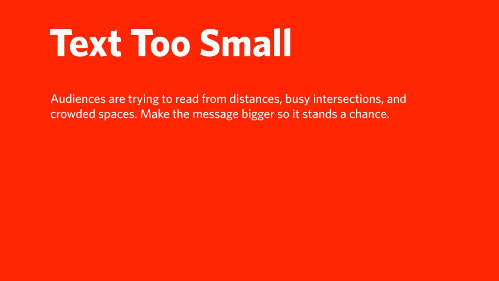
Text that is too small will not be readable from a distance.
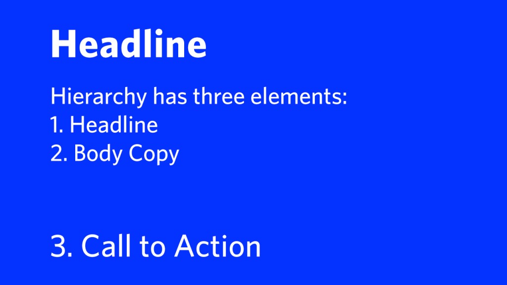
Communication Hierarchy
Include a headline, body copy and call to action.
Headlines
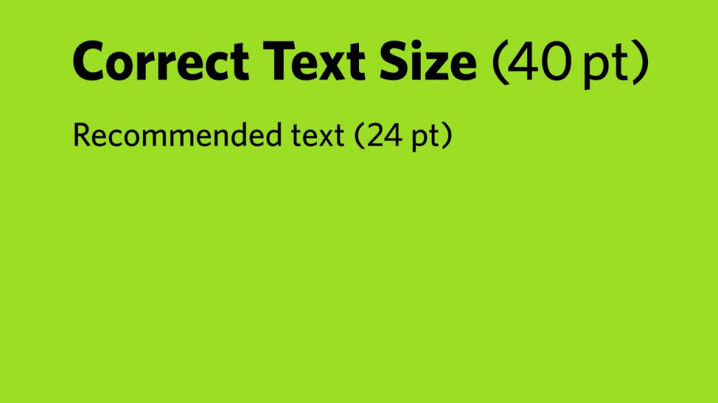
Headlines should be a maximum of 22 characters at 40 point.

Word Count
Maximize the Medium
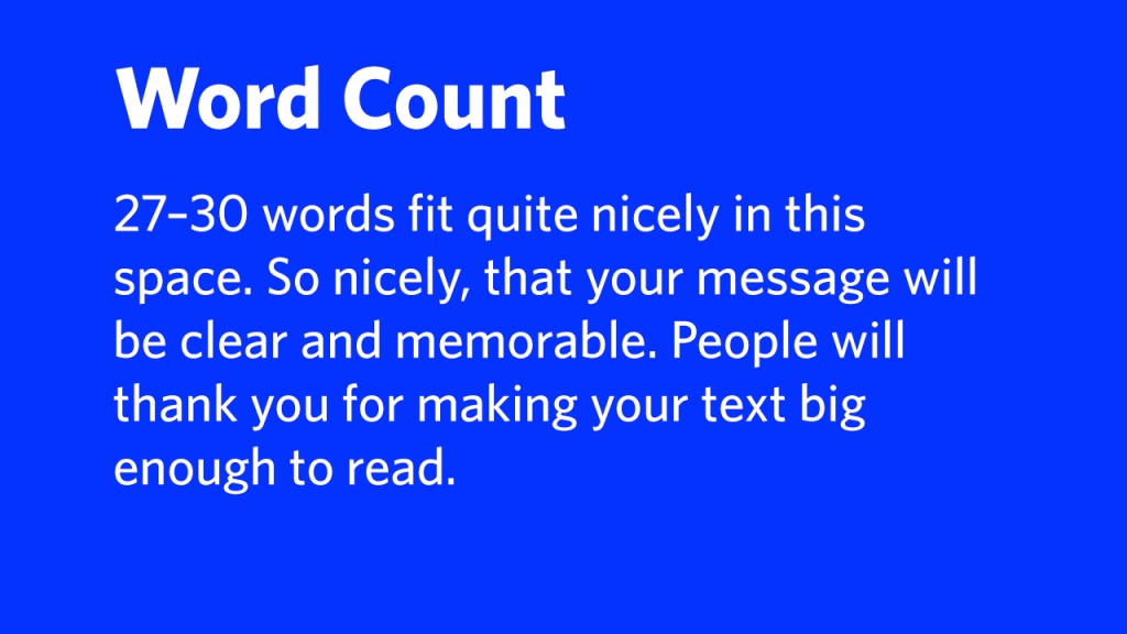
In order to work around copy space limitations on each image, Content Creators can export multiple images as a series.

Hyphenation
Use justified-left copy to avoid the need to hyphenate words.
Colour Principles
Background Contrast
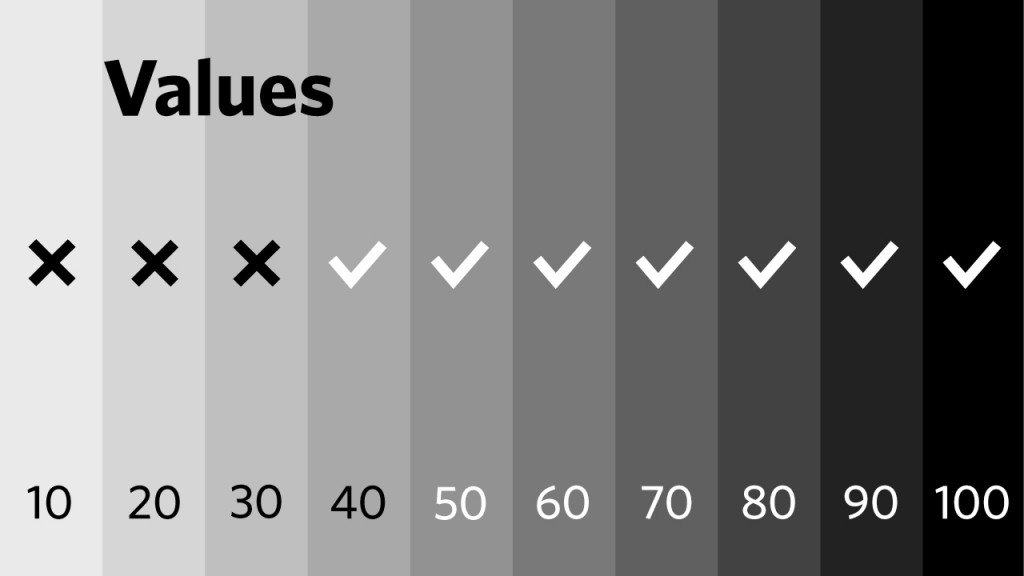
Increase contrast for a visual advantage. More contrast between foreground text and background colour is a good thing. In order to respect concerns related to light pollution and to increase contrast for greater readability, choose colour values with an equivalent of 40% black on the greyscale or use white type reversed out of a solid background colour.

Background Value
In general, use positive type overprints on background equivalent greyscale shades of 40% and below and reverse type (white) on backgrounds of 50% and above.
Opacity
Object Strokes
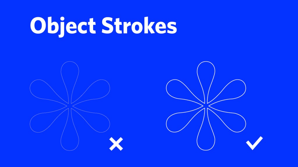
Use stroke weights that allow for visual integrity. strokes that are too thin will appear lost or
broken.
Colour
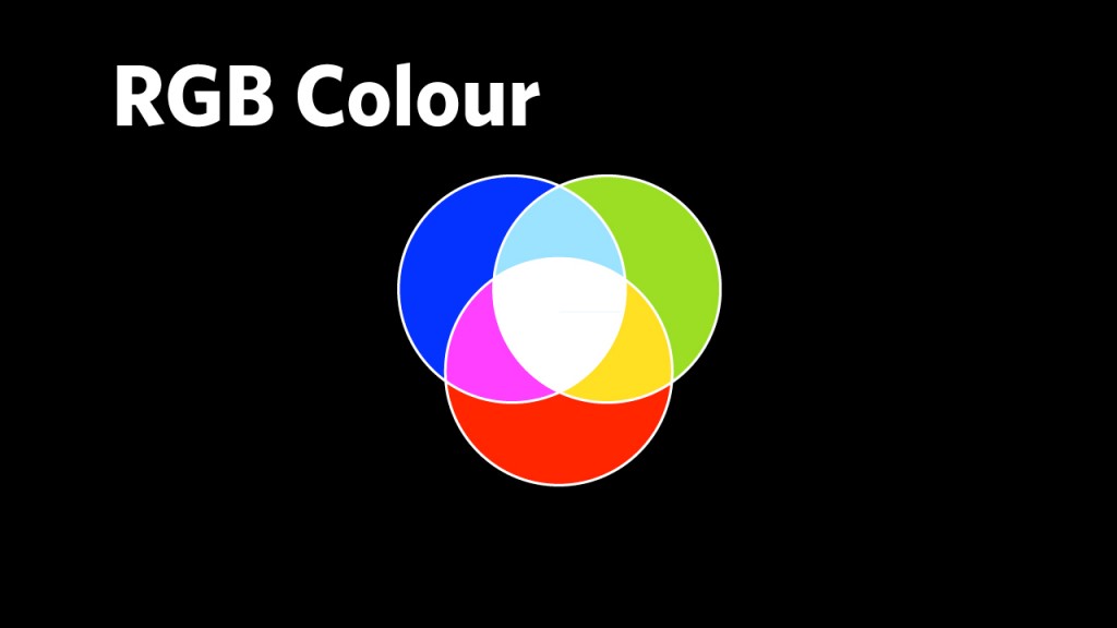
Colour is a design element that can be used to clarify communication and create visual impact. A good strategy for digital signage is to use high-contrast colour combinations but to avoid garish combinations. Colour must be selected in the RGB model for accurate display on signs. If colours are specified in CMYK there will be a difference between how they appear—and how they are intended to appear—on digital signage.
UBC Brand Colours
The UBC Brand institutional colours reflect the university’s positioning as a Tier One institution. UBC Blue is the primary colour and UBC Grey is the secondary colour. Consistent use of these colours is a key strategy used to promote brand consistency and expression.

The UBC Signatures and Colour
The UBC Signatures and UBC Logotype may be reversed out (in white only) of any colour background with sufficient value for reproduction clarity. Important note: The UBC Signatures and UBC Logotype can only be used in black when shown on any background other than white.

Typefaces – Whitney and Arial
Whitney
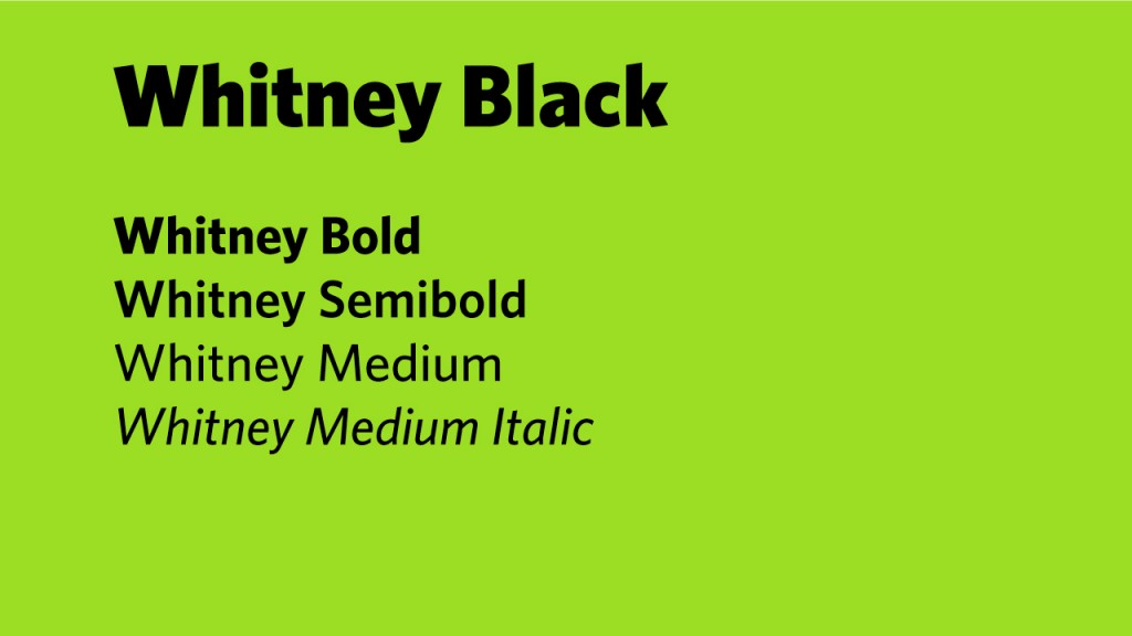
Whitney is the institutional typeface of the UBC Brand. Content Creators are encouraged to use Whitney for all brand applications including digital signage. Several units and faculties have obtained licenses to Whitney. Check with unit communications staff to find out if Whitney is available for use before making any additional purchases. The 12-weight family of the Whitney typeface can be purchased online along with the professional set.
Arial
Arial is the required alternate typeface to Whitney that is a standard systems font on all PC and Mac platforms. It offers a clear, readable typeface for on-screen displays and comes in a variety of weights.

Recommended Type Sizes
Headlines: 40 points
Body Copy: 24 points
URL/Call to Action: 28 points
